 Graph and PowerShell Blog
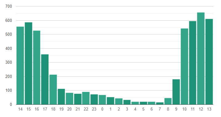
Visualising data via a bar chart can be an effective way to report on monthly totals. One of easiest ways of doing this is to create a chart with basic HTML. But if you have an outlier in your dataset then the chart can become distorted and hard to read.
↑ Basic HTML chart.
With this in mind I looked for a simple solution without spending a lot time learning Javascript. I finally settled on Google Charts, in part because the package should still be around in 10 years time. There are a number of different charts, some even with animations, but for my purposes I just needed basic bar and pie charts.
First we take in the data, you might want to limit it to the last 180 results so the chart fits on the page. We create the chart basics, then in the PowerShell for loop we add the records. You can add extra data to a hover over option on each record too, which keeps the chart simple.
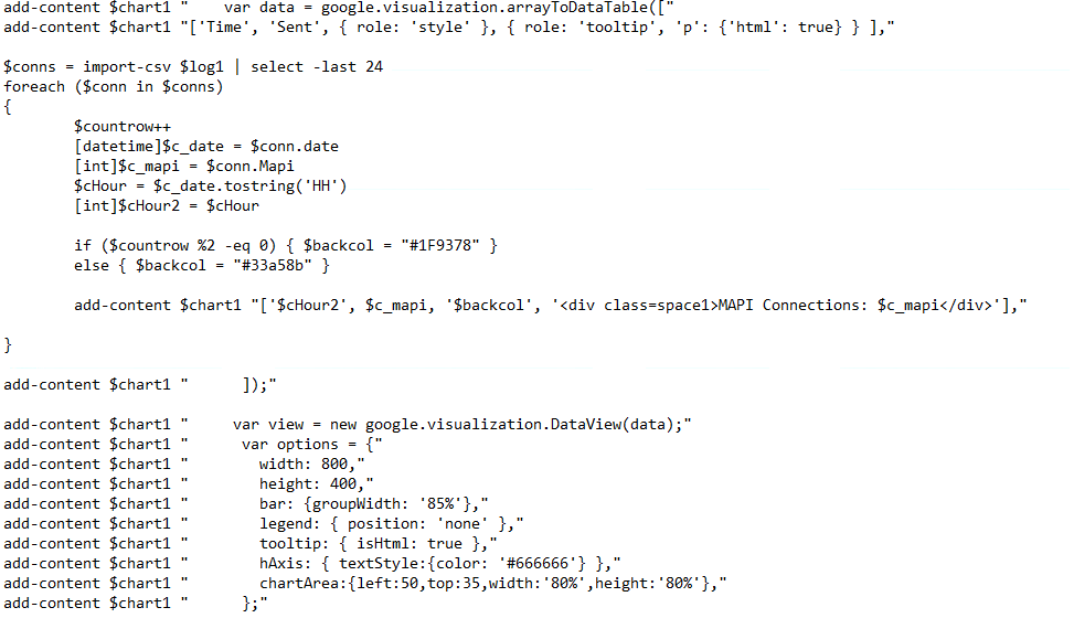
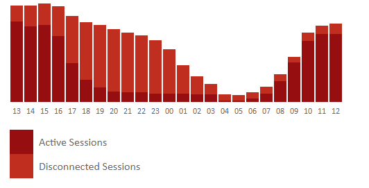
↑ We add a record for each hour of the last 24 hours using a PowerShell loop.
Finally, we output the chart onto the page.
↑ Google chart.